Introduction
The Checkbox component is a Selectable that controls a graphic which displays the on/off state and a Label of localizable text.
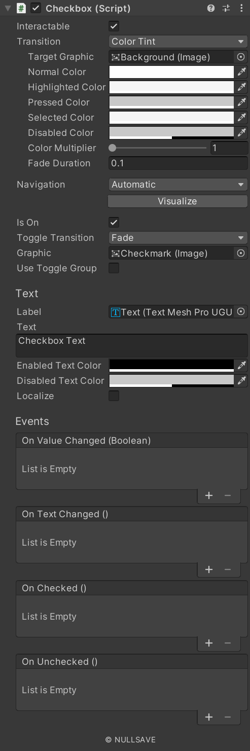
Fields#
| Name | Description |
|---|---|
| Toggle Transition | Transition mode for the toggle. |
| Graphic | Graphic affected by the toggle. |
| Use Toggle Group | Add Checkbox to a Toggle Group |
| Group Name | Name of the Toggle Group to use |
| Enabled Text Color | Color of text when interactable. |
| Disabled Text Color | Color of text when not interactable. |
| Localize | Automatically localize text. |
| On Text Changed | Event raised when text changes. |
| On Value Changed | Event raised when on/off state changes. |
| On Checked | Event raised when state becomes on. |
| On Unchecked | Event raised when state becomes off. |
| Target | Component used to display text. |
Properties#
| Name | Description |
|---|---|
| isOn | Gets/Sets the on/off state. |
| text | Gets/Sets text. On set text is localized if the localize flag is set |
| textMeshPro | Returns the TextMeshPro object displaying text |
| unlocalizedText | Returns the text supplied before localization |