Introduction
This component provides a GUI tooltip that can display Item UI data.
Fields#
| Name | Description |
|---|---|
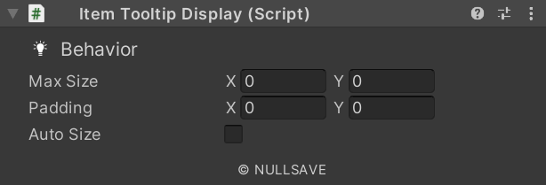
| Auto Size | Automatically resize container |
| Resize Source | Component used to determine size needs |
| Equipped Compare | Equipped Compairison |
| Equipped Item UI | Equipped ItemUI |
| Equipped Container | GameObject to show or hide based on equipped item |
| Item UI | Gets the Item UI used to display the data |
| Id | Id used to find this display indirectly |
| Padding | Padding to add when resizing to fit tooltip text |
| Max Size | Maximum size of the tooltip |
| Tip Text | Component used to display tooltip text |
Properties#
| Name | Description |
|---|---|
| CalledBy | Tooltip client that called this display |
Methods#
| Name | Description |
|---|---|
| ShowTip | Display tooltip text. |