Introduction
This component allows an Item UI to display a more detailed tooltip using the Merchant Item Tooltip Display.
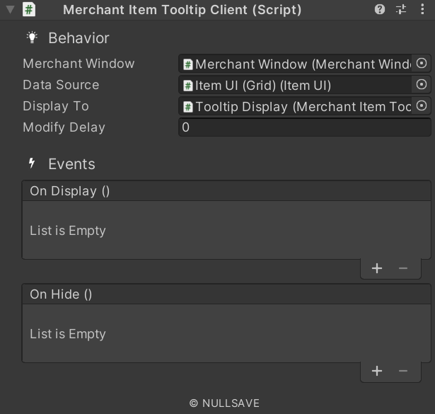
Fields#
| Name | Description |
|---|---|
| Merchant | Merchant window supplying data |
| Data Source | Item supplying additional data |
| Display To | Prefab or object used to display data |
| Dynamic Text | Display static text |
| Text Source | Display static text |
| Tooltip | Tooltip text to display. |
| Modify Delay | Number of seconds to modify the display delay for this time. |
| Custom Source | Source of custom UI |
| Custom Tooltip | Custom tooltip prefab |
| Custom Id | Id of Custom UI to use instead of the normal Interactor UI |
| On Pre Display | Event raised just prior to displaying tooltip |
| On Init Custom Tip | Event raised when custom tooltip is initialized |
| On Post Init | Event raised after initialization |
| On Display | Event raised when tooltip is displayed for this object |
| On Hide | Event raised when tooltip is hidden for this object |
Properties#
| Name | Description |
|---|---|
| customDisplay | Gets any requested custom TooltipDisplay |
| parameters | Gets/Sets any parameters for the tooltip |
| showable | Gets if the tooltip can be shown |
| tipText | Gets the tooltip text |