Introduction
This component handles displaying Crafting Queue items in a grid.
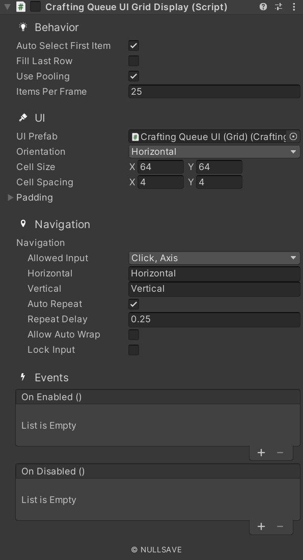
Fields#
| Name | Description |
|---|---|
| Ui Prefab | Prefab to create for displaying item |
| Cell Size | Grid cell size |
| Cell Spacing | Grid cell spacing |
| Padding | Layout padding |
| Fill Mode | Set how to fill out the area |
| Auto Select First Item | Automatically select the first item on start |
| Use Pooling | Use object pooling to reduce number of items created |
| Items Per Frame | Maximum number of items to load per frame (0 or less = all) |
| On Enable Changed | Event raised when enabled state changes |
| On Selection Changed | Event raised when selection changes |
| On Item Added | Event raised when an item is loaded by the display |
| On Item Removed | Event raised when an item is removed by the display |
| On Enabled | Event raised when display becomes active |
| On Disabled | Event raised when display becomes inactive |
| On Drop | Event raised when an item is dropped on this one |
Properties#
| Name | Description |
|---|---|
| selectedIndex | Gets/Sets the selected index |
| itemsPerRow | Gets the number of items in a row |
| lockInput | Gets/Sets if input is locked |
| orientation | Gets/Sets the object orientation |
| source | Gets/Sets the source of data for the display |
| secondarySource | Gets/Sets the secondary source of data for the display |
Methods#
| Name | Description |
|---|---|
| ClearItems | Clear all items from the list |
| DrawItems | Draw all items to display |
| GetSelectedItem | Get the selected item as requested type T |
| ItemAdded | Item of type T added to existing list |
| ItemRemoved | Item of type T removed from existing list |
| SetSelectedItem | Set object as selected and update the selectedIndex to match |
| ResetIndex | Reset the selected index |