Introduction
This UI component displays information about a specific Status Condition
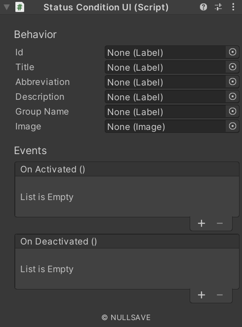
Fields#
| Name | Description |
|---|---|
| Tooltip Format | Format to use when displaying Tooltip UI |
| On Activated | Event raised when Status Condition becomes active |
| On Deactivated | Event raised when Status Condition becomes inactive |
| Image | Image used to display Sprite |
| Colorize | Apply color to image |
| Labels | List of labels and formats for displaying information |
| On Click | Event raised when the item is clicked |
| On Double Click | Event raised when the item is double-clicked |
Properties#
| Name | Description |
|---|---|
| condition | Gets the currently associated Status Condition |
| info | Information about the item |
Methods#
| Name | Description |
|---|---|
| Load | Loads a Status Condition for display |