Part 4: Basic UI
GDTK: Stats comes with an array of UI items for you to easily display information to your user. These items can be quickly accessed by right-clicking in the Hierarchy and selecting UI > GDTK: Stats
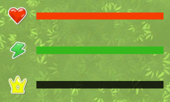
Stat Progressbar (with Icon)#
UI > GDTK: Stats > Stat Progressbar (with Icon)
This component creates UI element for you to visualize the value of Stat including a progressbar and image for displaying the associated icon.

| Field Name | Description |
|---|---|
| Source | Where to find the Stat Source (Direct Reference or Find In Registry). |
| Stats | Direct reference to Stat Source. |
| Key | Key used to find Stat Source in the Tool Registry. |
| Value Id | Id of the Stat used to provide the Value on the progressbar. |
| Minimum Id | (Optional) If blank the same Stat is used to set the Minimum of the progressbar, otherwise the Stat supplied here is used. |
| Maximum Id | (Optional) If blank the same Stat is used to set the Maximum of the progressbar, otherwise the Stat supplied here is used. |
| Image | Image component used to display the icon associated with the Stat supplied in Value Id. |
| Color Image | If checked the Image will have it's color changed to match that supplied in the Stat. |
| Color Progress | If checked the Progressbar will have it's fill color changed to match that supplied in the Stat. |
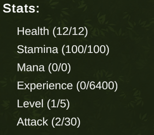
Stat List UI#
UI > GDTK: Stats > Lists > Stat List
This component creates UI element that lists all Stats associated with a Stat Source that are not marked as Hidden. A Template object is also automatically created.

| Field Name | Description |
|---|---|
| Source | Where to find the Stat Source (Direct Reference or Find In Registry). |
| Stats | Direct referecne to Stat Source. |
| Key | Key used to find Stat Source in the Tool Registry. |
| UI Prefab | Scene or Prefab Stat UI component to instantiate for each Stat. |
| Content | Transform to set as the parent for each instantiated object. |
| On List Updated | Event raised whenever the list is updated (including on start). |
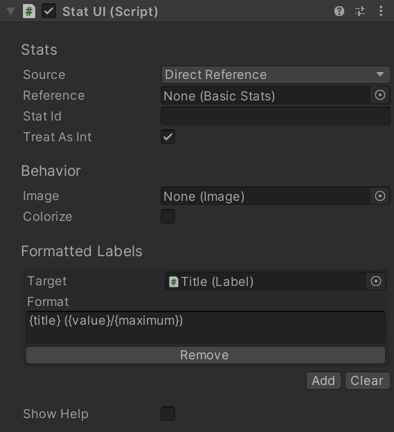
Stat UI#
UI > GDTK: Stats > Stat UI
This component creates UI element that displays information for a specific Stat. One is automatically created as a template for the Stat List UI but you can also reference Stats manually one at a time using this component. If you reference a Stat manually, you can display information even if the Stat is marked as Hidden.
| Field Name | Description |
|---|---|
| Source | Where to find the Stat Source (Direct Reference or Find In Registry). |
| Stats | Direct referecne to Stat Source. |
| Key | Key used to find Stat Source in the Tool Registry. |
| Treat As Int | If checked when any value on the Stat is displayed it is first converted to an int. |
| Image | Image used to display the icon associated with the Stat. |
| Colorize | If checked the Image will have it's color changed to match that supplied in the Stat. |
Formatted Labels#
This array is used to add one or more Label controls that have their values updated to reflect data about the Stat.
| Field Name | Description |
|---|---|
| Target | Label to use when setting text |
| Format | Format to use when setting text on the Target. |
Show Help#
When this option is checked a helpbox will display all of the available formatting options and their descriptions.
Note#
When being used by the Stat List UI the following fields are automatically set and can be ignored: Source, Stats, Key.